Lincoln Sync 3 Infotainment Review
Many of the newer Lincoln products might be vastly different in design and experience than their Ford counterparts...

Lincoln Sync 3 Infotainment Review
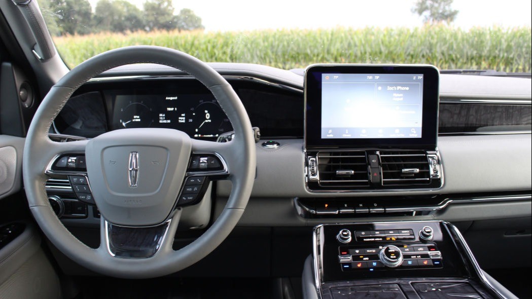
Many of the newer Lincoln products might be vastly different in design and experience than their Ford counterparts, but infotainment software is still heavily shared between the two brands. That said, Lincoln has made a great effort to make its version of Sync 3 feel more upmarket and premium compared to Ford’s.
If you can think of it in terms of Android smartphones, Sync 3 in Ford vehicles is like stock Google software. Sync 3 in Lincoln products is akin to Samsung’s UI, which amounts to a totally new look and added features. The core interface remains the same across the two brands. Lincoln’s snazzy new look can be customized with a few different color combinations, but they generally all consist of muted tones that exude old-world luxury more than the heavy-handed blue hues on Ford's version of Sync. One convenient commonality between the two is Apple CarPlay and Android Auto capability, both of which require wired connections. Some may find the functionality of the Apple/Android interfaces to be compromised as detailed in our Ford Escape interior driveway test).
Sync 3 has a bottom bar of quick toggle, commonly-used apps, and a Home button in the top left corner. It makes getting to any particular set of menus quick and painless. Squared-off icons are used within menus with large font and intuitive scrolling functionality. There are no redundant scroll wheels or touchpads to control the screen interface in any of Lincoln’s vehicles, so you’ll need to be comfortable with a touchscreen. Thankfully, there are hard buttons on the dash for the climate controls and common audio functions.
In the Lincoln Navigator we’re using to demonstrate the technology, Sync 3 is smooth and generally free of hiccups. However, it’s not infallible and tablet-smooth as plodding through BMW’s or Mercedes’ latest infotainment systems is. Lincoln uses Sync 3 on all of its current models, and in the Navigator, it’s playing on a large 10-inch screen.
The added luxury features for Lincolns tends to dictate all of the extras you see in the software. There are settings for a vast array of ambient lighting, hugely complex seat controls (for the 30-way massaging seats) and a number of customization options for the excellent Revel audio system (optional). Lincoln differentiates itself even further with the fully digital instrument cluster flanking the big screen. The Lincoln's is simplicity taken to another level, which is perfect for a panel with a singular purpose of informing the driver of vital vehicle information. Our biggest complaint about the cluster is the speed at which it moves through screens and animations. There’s a good bit of lag between button press or mode dial movement before anything happens on screen. Speed this process up, and it’ll feel like a much more polished product.
Simplicity and ease of use are the two overarching themes that come to mind when we take a step back from using Sync 3. Sure, you can experience “ENERGIZING COMFORT” in a Mercedes-Benz and “Caring Car” modes in a BMW (both unnecessary but undeniably interesting comfort programs), but the interfaces of those infotainment systems are designed with the tech-savvy buyer in mind. Assuming you take the time to learn the intricacies and complex menus, the benefits are much greater than what Lincoln can offer. However, there’s a lot to be said for simple, pretty software that gets the basic job done right. Lincoln’s Sync 3 does exactly that.